An introvert's guide to creating things people want
Understanding people and how they want is challenging. We have more information than insight and less time than ideas. Let's tackle those!
Ended
As I tune in what's good/bad/curious about different designs and experiences everywhere, I'm more able to spot opportunities or issues in my own work.
So, here are 5 designs I noticed while in Seoul, Korea! They each spark general questions and strategies that can be applied to other businesses/products/services.
--
Train stations are wonderful spaces for noticing design and human behaviour -- I'm there often, and usually not long enough to dive deeply into anything... so, I switch to a "soft" focus on my surroundings, rather than the "hard" focus of replying to emails.

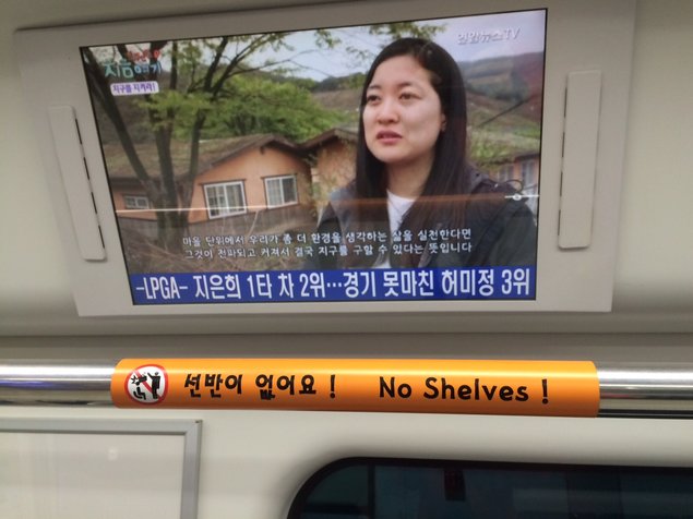
1. "No Shelves" Sign
This sign probably comes from an employee noticing/hearing about an accident -- so I wonder if there are other common complaints, misunderstandings, errors, injuries, etc that can be tackled with a sign... at least temporarily.
The graphic on the sign is what first caught my attention -- so I wonder how to make this linguistic sign into a more visual one.
I wonder if we can do away with the sign completely -- perhaps painting the pole a color that contrasts it from the background and makes it visually obvious that it's not a shelf, or using the head room for advertisements to leave no space for baggage.
I wonder if the physical structure itself can be changed, and if it's even worthwhile to do so -- perhaps by removing the pole entirely, or just adding a shelf, as many other trains have. Perhaps the pole is not a hard limitation, but an imaginary one.

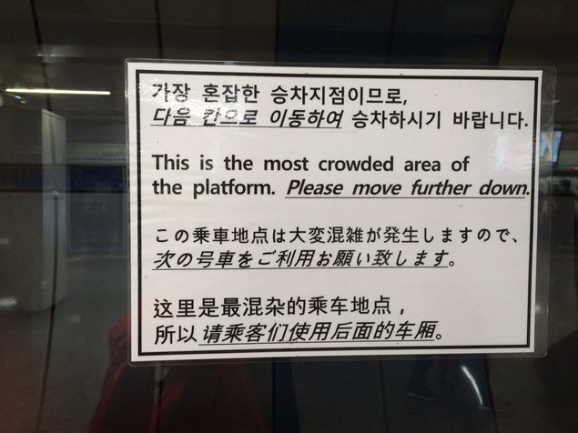
2. "Please move further down" Sign
A simple, easy solution to address the problem of an inconsistently crowded train platform -- or at least begin to. This solution just takes one keen employee to print a sign, and can potentially be very effective!
4 languages can be limiting, so I wonder about a ubiquitous visual to communicate that the current location is crowded and/or to suggest moving over. The visual could be bigger than a sheet of paper, perhaps an artwork on the walls of the station to make some areas look more spacious and attractive.
I wonder about external incentives to change people's behaviours -- for what reason would they walk a few extra meters? Perhaps extra seating, or vending machines, or artwork? Perhaps the thought of having more space on the train is enough?
This is just one station, but this is a problem that people have at many stations, so what is the bigger picture? How do the components in a system impact this problem -- how does the usage of one station affect another's crowdedness? Do they all have the same placement of stairs, such that the same train cars are always crowded?

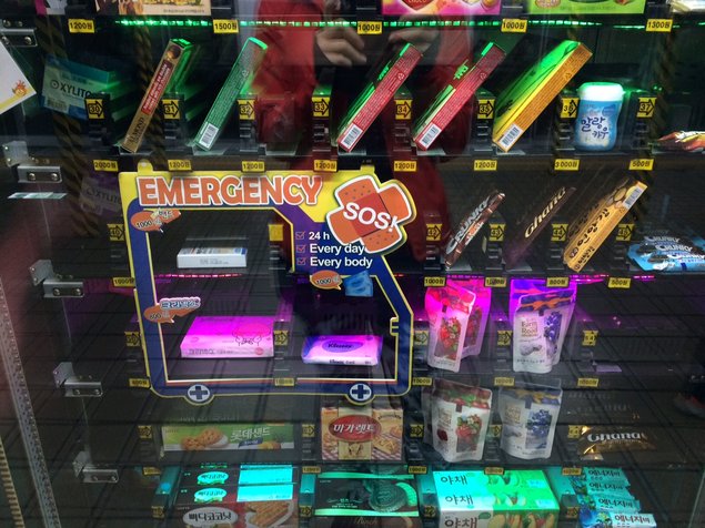
3. Extra convenient vending machine
In addition to a range of snacks and gum, these train station vending machines also offer tissues, wipes, and cough drops.
To me, this expands our traditional schema of a food/drink vending machine -- this vending machine is more like a convenience store, a no-hassle place you can run to for your primary on-the-go commodity needs.
It makes me wonder what other distribution channels or infrastructure I can use for something else, to deliver more of what the customer needs, in the way that they are used to receiving products/services?
Challenges also come to mind -- what if this new version becomes the norm and the expectation? What problems might occur if people expect emergency/conveniences from a station where it is not provided?
--

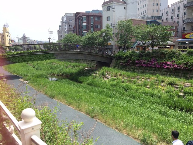
4. Half river, half park - Cheonggyecheon
This beautiful river park runs through Seoul's downtown, spanning the core of the city with 7 miles of green space to stroll, run, and rest. (It was actually covered by a highway and then later restored!)
This expands on the concept of a "park," which I usually imagine as a large rectangular green field, covering a few city blocks.
But when people want a "park," what they'd really like is probably a convenient sunny greenery, a space to relax and take break, a portal into nature, perhaps a place for running and biking.
This river park meets those needs better than a rectangular one (which close to a few people and far from many people), and creates an energising space with resources that already exist (river path).

5. Social Media discounts
An attraction I visited offered 20%-30% discounts in exchange for various social media favours. This felt very awkward and inauthentic, as I would be forced to like and share before experiencing the attraction. I am likely to get the discount, but delete the post and unlike them right after I leave.
But social media is very important to many businesses, so I wondered, how could these social media favours be attractive and authentic?
I go back to the "root why" -- What was the purpose of this discount originally? Was it to attract people with better prices? Garner a large number of likes/follows? Encourage word-of-mouth advertising? (I think WoM is most likely).
Sharing before the experience is inauthentic, but sharing afterwards is genuine and results in better posts/pictures (assuming the attraction is good!) Customers could get the discount and pay after (if there is trust or a good exit process), or get a refund (perhaps in cash, or via a gift, if credit card refunds are difficult).
--
I enjoy paying attention to design and experience as I travel. I notice I pay more attention when I travel, perhaps because an unfamiliar space puts me in a mindset of curiosity and learning.
I'm working on having that "tourist mindset" when I'm not traveling, too.
Angela O
P.S. The finalised new book contents, and a confirmation/refund of your order, to come!